First, load the trivia_stats.R source file, which contains all functions for generating statistics:
source("trivia_stats.R")Player Similarity Table
This chart measures how similar players’ scores are on a given round after adjusting for round difficulty. In the original post, bias measured how well a player does on another player’s rounds, while the similarity table focused on how similarly two players perform across all the rest of the rounds.
player_similarity_table()The post also included a 3D representation of that similarity table obtained using Bayesian Principal Components Analysis (BPCA). The locations in 3-space were not meant to be interpreted directly; only proximity mattered.
plot_3d_similarity_plotly()Bias Heatmap
Each column represents the scores on one person’s round that week. Higher scores in a cell mean that the player tends to gain more points than other players on that creator’s rounds.
Estimated Score Per Round = Average Score + Round Difficulty + Bias
bias_table_heatmap()Scores on a Creator’s Round
The original post also included an overlay plot of average score on each round by week, followed by creator-by-creator plots where the red line represented the average for that week and the blue points showed individual scores.
creator_overlay_plot()

generate_creator_plot("Alex")
generate_creator_plot("Chris")
generate_creator_plot("Dad")
generate_creator_plot("Drew")
generate_creator_plot("Ichigo")
generate_creator_plot("Jeff")
generate_creator_plot("Jenny")
generate_creator_plot("Megan")
generate_creator_plot("Mom")
generate_creator_plot("Zach")
Scores by Player
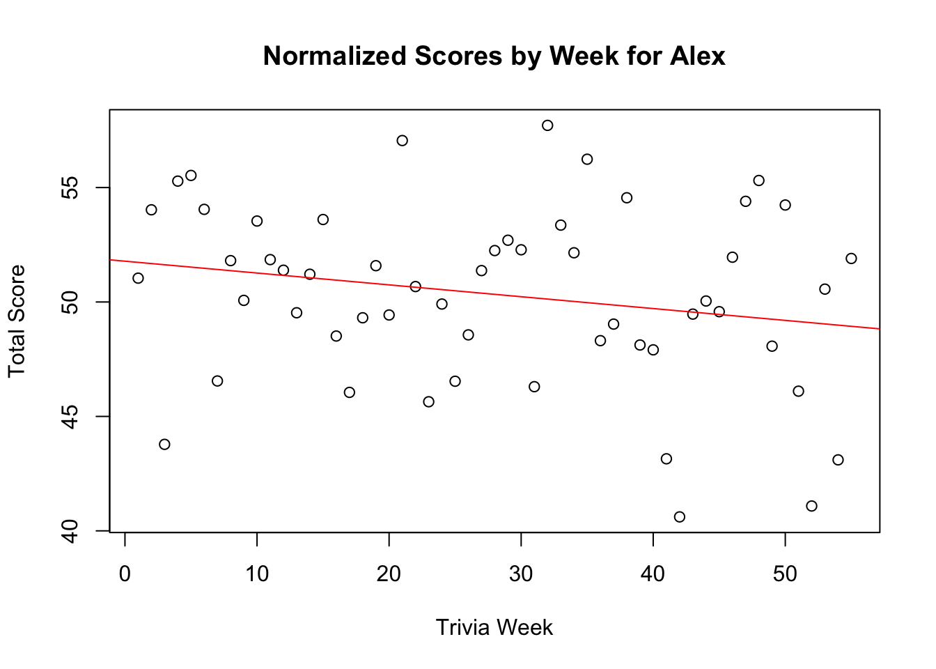
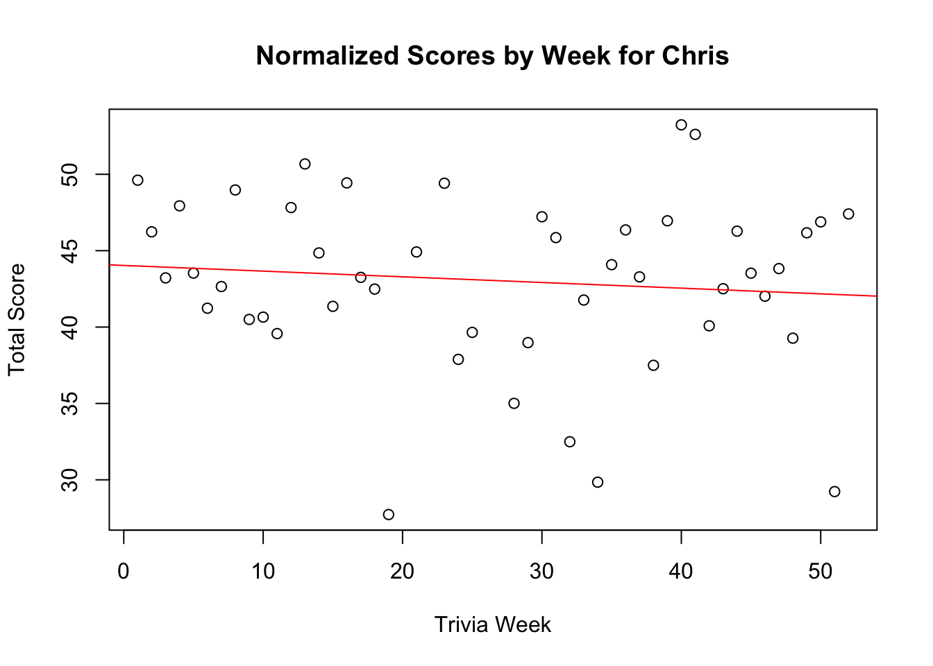
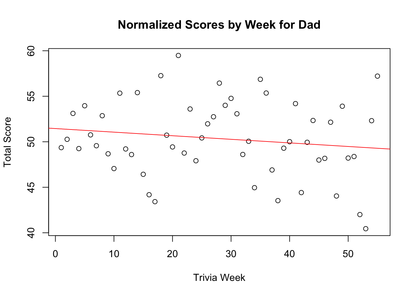
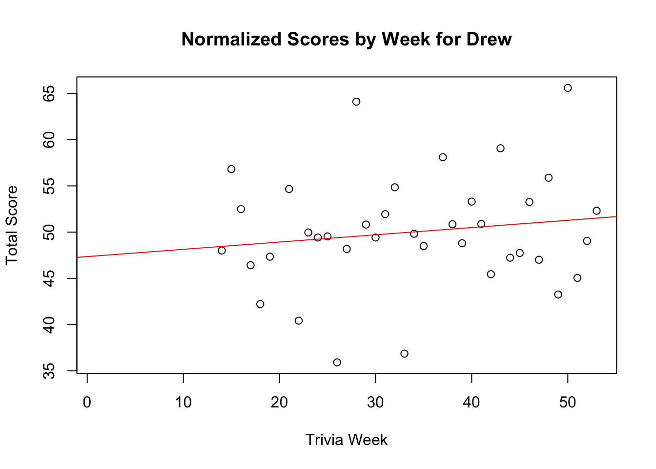
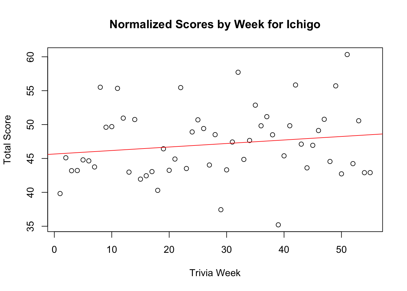
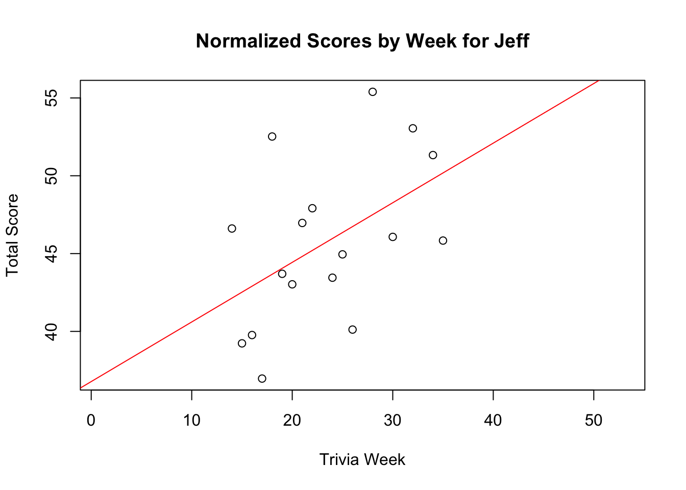
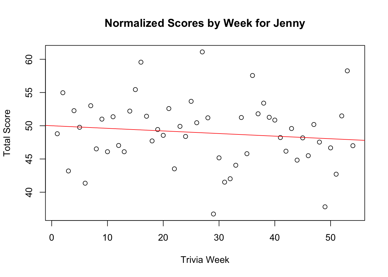
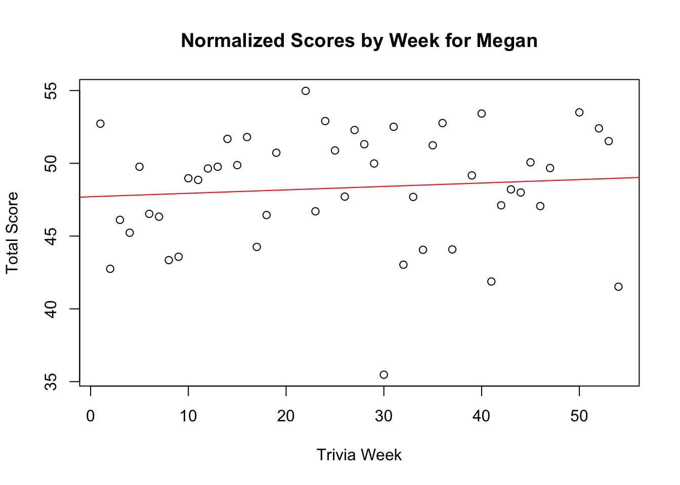
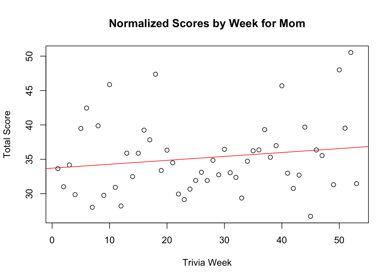
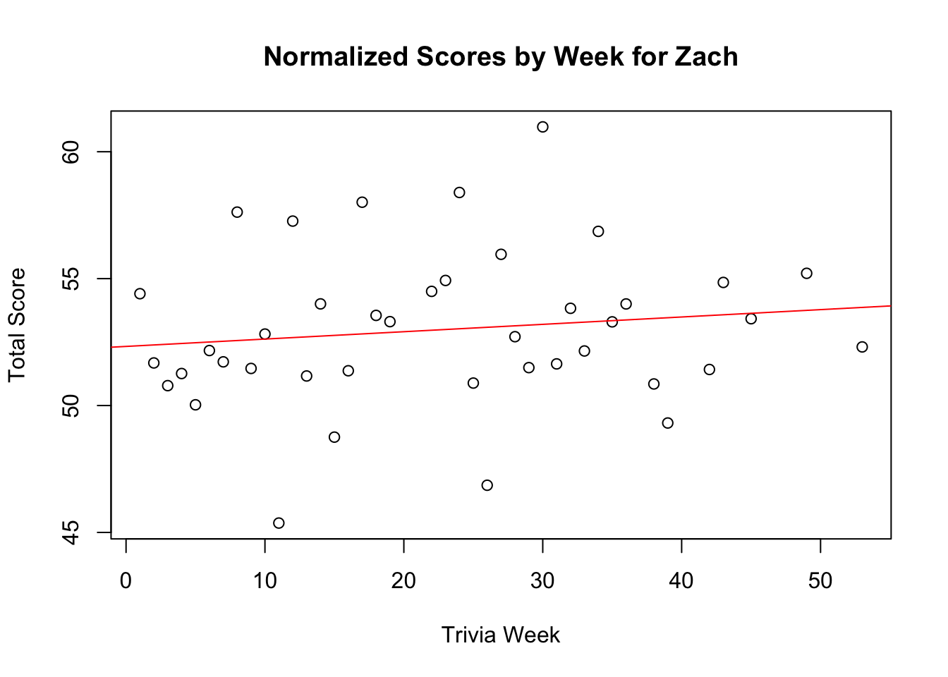
These are the original embedded figures from the post. Each plot shows one player’s final score by week, along with the regression summary the post used to look for possible long-term trends.